What happens when you blend the timeless truth of scripture with the timeless style of Mid-Century Modern design?
You get something honest, grounded, and beautiful—just like our generation.
✨ Gen X: Born in the Middle, Built for Purpose
If you’re part of Gen X—born between 1965 and 1980—you know the feeling of being “in between.” We’re not Boomers. We’re not Millennials. We grew up analog and came of age digital. We’ve watched the world change at lightning speed.
But we weren’t an afterthought. God placed us right here, right now—on purpose, for a purpose.
Like Esther, we were created “for such a time as this.” We carry the resilience of those before us and the vision for those ahead. And we have something to say.
🎨 Faith Expressed Through Design
For many of us, art is how we speak—how we pray, how we process, how we encourage. And there’s no more fun or nostalgic way to express it than through Mid-Century Modern style.
With its clean lines, calming tones, and energy, MCM feels like a visual echo of our faith:
Order in the chaos.
Beauty in simplicity.
Hope anchored in something timeless.
When we pair scripture with this design style, we’re not just making something pretty—we’re putting truth in motion. We’re taking God’s Word and wrapping it in a visual that speaks across generations. And it doesn’t matter if you’re older or younger, there’s a spot for you. We were all created for a purpose and are placed here in this very moment by God
📖 Hebrews 6:19 — Our Anchor and Esther 4:14
That’s what inspired this visual devotional:
“We have this hope as an anchor for the soul, firm and secure.” — Hebrews 6:19
“… for just such a time as this? “ – Esther 4:14
In a drifting, shifting world, God’s Word holds. And as Gen X believers, we’re called to share that anchor—with beauty, with boldness, and yes, with a little retro flair.
🎥 Watch & Reflect
Whether you’re a designer, a dreamer, or a Gen Xer rediscovering your voice, this space is for you. Let’s create, encourage, and stay anchored, together.
Please leave a comment how you share your faith and encourage others.
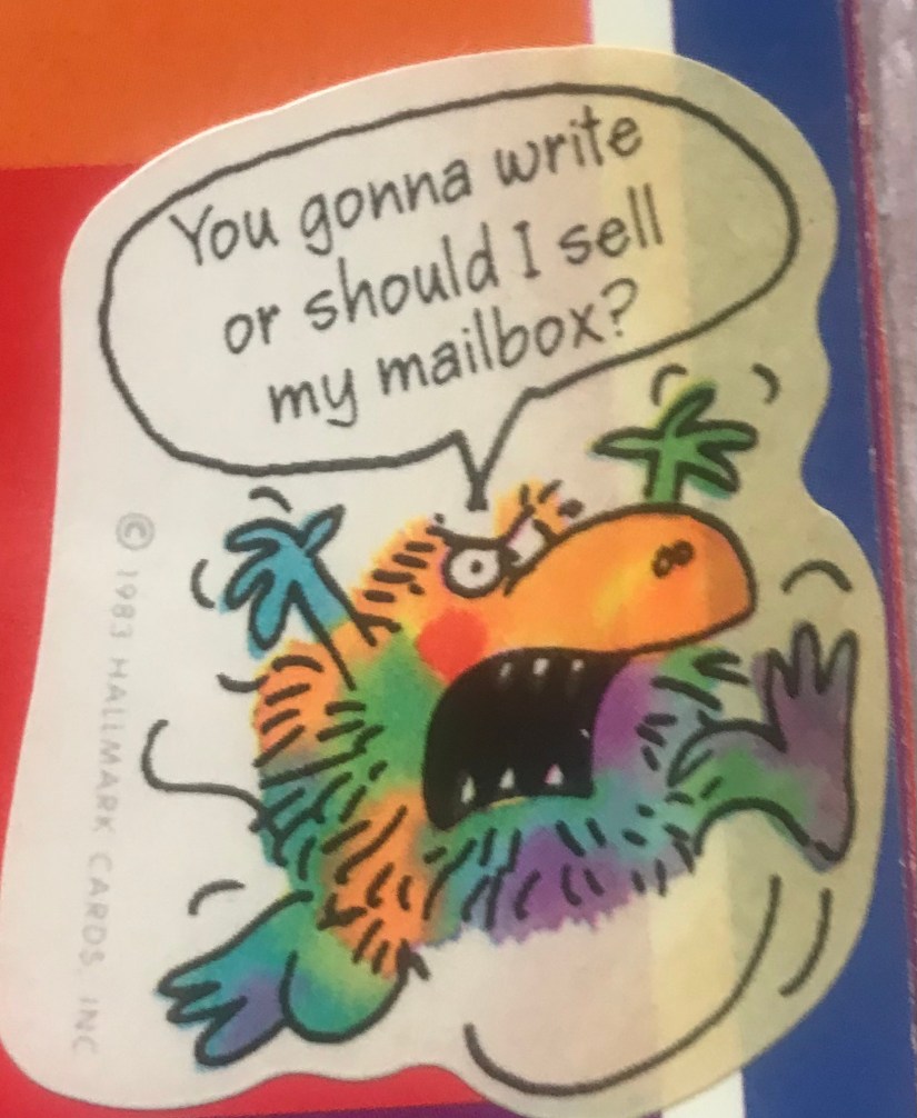
In the last blog post, I shared a little about what the Anchor Angel Project is and how you can be part of it. The idea came from a friend of mine who had been walking through a long, difficult season. I started sending her memes, Bible verses, articles, care packages, and cards—just little things to lift her up. One day she referred to me as her “anchor angel,” and that phrase stuck. After that, my imagination took off.
Since I was a little girl, I’ve always loved making cards for my family. I used to dream about working for Hallmark someday—LOL. I’ve always loved to design, draw, paint, hand-letter… just create. Making greeting cards became one of my favorite ways to express myself and brighten someone else’s day. I don’t always have the time to make them as often as I’d like, but I’m hoping that by making this project my mission, I can do it more consistently—and encourage others to do the same.
We’re reminded in 1 Thessalonians 5:11 to “encourage one another and build up one another, just as you also are doing” (NASB1995). A simple greeting card can be such a beautiful way to do that. It’s a tangible reminder of God’s love and your thoughtfulness. Tuck one into a care package. Send a photo card with a favorite old memory—like that beach trip you always laugh about or a random Tuesday that turned into a lifelong moment. The recipient might even frame it. It’s a little thing that can have a lasting impact.
A handmade card is personal. It’s heartfelt. It’s a surprise in a world of bills and junk mail. When was the last time youopened the mailbox and felt your heart smile from something totally unexpected?
That old saying, “It’s more blessed to give than to receive,” is so true. There’s a special kind of joy that comes from knowing you’ve encouraged someone else. It encourages me, too.
So—who will you bless this August? Who will be your three? I’d love to see your creations! Follow The Kedge Anchor on Facebook and Instagram and share your cards with #anchorangelproject.
And hey—there’s still more to come. I haven’t revealed everything yet… there’s a little twist on the horizon. Have you guessed it?
Happy Friday and Happy Weekend Eve!! I am so ready for the weekend—how about you? 🧡
Welcome to May 7, 2024 where only in the USA would we celebrate packaging. Well, not just packaging, packaging design. As unusual as this maybe, from an artist’s perspective, not so unusual.
The actual physical design of a package takes the mind of an engineer. I am not wired that way. But the decoration or design on the package takes an artist, a graphic designer. Back in my day they were called commercial artists. Still not my wheelhouse. The closest thing I come to making a package is for a greeting card which you can watch a video here. And if you think about the front of a greeting card, it could be considered packaging for a sentiment. It’s a stretch.
Packaging goes back to the 1800’s and they were expensive. It was mostly reserved for luxury items, like jewelry and were not disposable. Manufacturers saw an opportunity and a benefit to promote “after use”, what we call recycling today or repurpose.
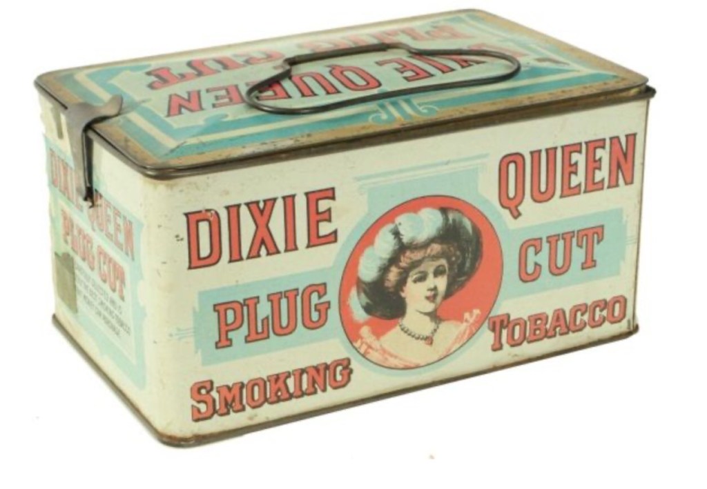
The punch-cut tobacco tins originally designed by the Dixie Queen company to resemble picnic baskets, and then came the lunch boxes. Dixie Queen company was stamped on the tin and these such items were popular into the early 1900’s.
This branded consumer packaging became popular in the 1900’s and the tradition continues today. The reusable grocery bag is a good example. How many other products do we buy that the packaging is reused or repurposed. Amazon boxes don’t count. My skin care products come in a nice sturdy box with magnetic closure that I use to organize my art supplies. I like to think I get more than just product, I get organization too.
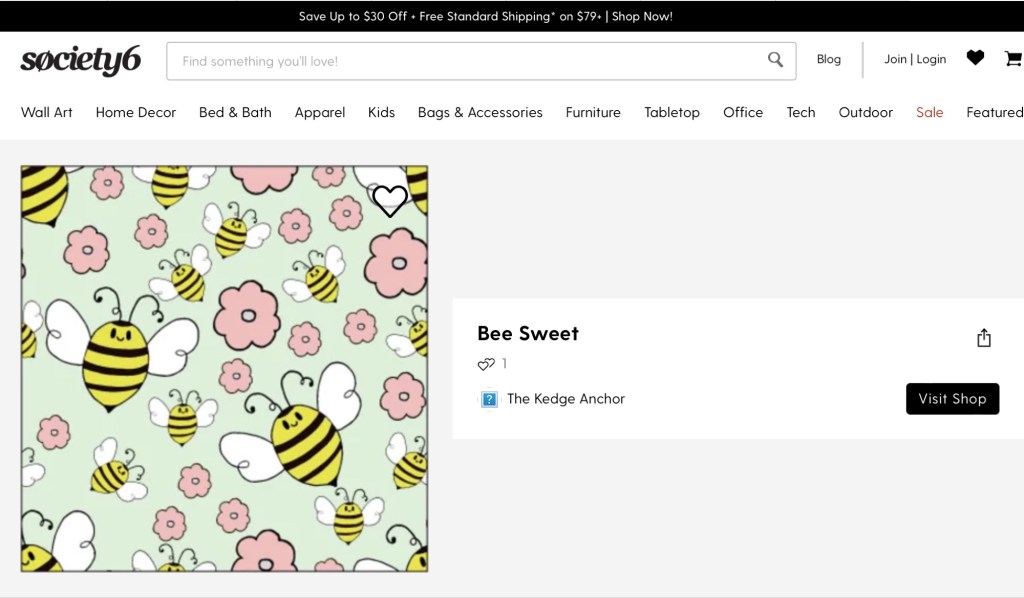
Surface Pattern Design is a huge industry and probably something we take for granted. The next time you buy wrapping paper, or a notebook with a floral pattern, someone designed that. For instance, you can find this “Bee Sweet” pattern in my Society 6 shop.
Branding plays a huge role in how consumer’s decide in making purchases, from its attractiveness to its physical design. Think about it the next time you are out shopping or have to open one of those clam shell packages. Click on the link for further reading on National Packaging Design Day.
How much does the actual design and attractiveness of an item influence your purchase?
In the last post, I shared a creative process. I made up a game called “What If…” What if I just sat down to paint? What if I just made some marks? What if I mixed green and orange together? What if I tried something new or different? So I did. I sat down to paint and play and try some new art supplies. And I surprised myself.
When I was done, I actually liked what I painted. Was it perfect? No. Could I make improvements? Of course. Then I began to think. What if? What if I took more risks, more chances? What if I was more in tuned to hearing God’s voice? What if I was and obeyed Him? I guess this is where I began to reflect on areas in my life where I am hesitant to obey, not hearing to obey or just not obeying.
My intention in my artistic exercise was to paint, to stop procrastinating and do what brings me joy. It wasn’t to make a perfect piece of art, it wasn’t for anyone it was for me. Sometimes I find it hard to find time to do just this, paint. Once I began to evaluate what I was doing with my time, I began to see pockets of time with which to create. I really need to keep time limits on scrolling social media. When scrolling takes away from what I need to do and what I enjoy doing, it becomes an issue. Now, when I find I have an idol moment, if there is nothing pressing on my to do list, I choose to do something artistic. This takes a bit of practice, training, discipline.
When it comes to obeying God I believe the same can apply. It takes training, practice, discipline. I first need to actually recognize His voice and I can’t do that if I’m not reading His word daily. What’s my intent when I read my Bible? Like when I sit down to paint, why am I doing this? My intent is to hear God’s voice so that I can obey Him. Sometimes I feel like I’m not obeying because I’m not sure I am hearing His voice. John 10:27 – “My sheep hear my voice, and I know them, and they follow me:” and there’s more, a promise, a blessing verse 28 “And I give unto them eternal life; and they shall never perish, neither shall any man pluck them out of my hand.”
Sometimes I feel like I am missing out on some things, blessings, because I am not paying attention to the God’s voice. God knows my heart. So when I am earnestly trying to do what I think He wants me to do in a situation or even in the slightest seemingly, smallest thing I know He sees me trying. Many times I fail. He might be telling me to reach out to someone and I may be hearing a voice that says “don’t disturb them.” Or it could be buy extra food at the grocery store and I hear, “you’re on a budget.” If God is telling me to buy extra food, it’s not for us. It’s for someone else. There have been times my husband has come home from work and asked if I could pick up some extra cans of soup, granola bars or cereal for the food closet at work and I listened to the voice that told me I was on a budget. Ugh!
Now that I have recognized this pocket of time, I need to act on it and paint or draw. Take the risk. Recognizing God’s voice is still a work in progress. When I recognize it I need to obey it. Take the risk. That’s a risk that will always give a return on investment. I can’t lose. I can’t loose by making messy art, I can still learn. It may not be pretty but I will walk away learning to do something or not do something. By obeying God, I really can’t lose. Even if I mess up somehow, God will work out my mess, Romans 8:28, “And we know that in all things God works for the good of those who love him, who have been called according to his purpose.”
What if…, what if I stopped procrastinating and painted or did something creative everyday? What if I stopped to hear God’s voice everyday and obeyed? What if…?
This is a real brief history. I won’t bore you with all the details so I’ll leave a some links for further reading.
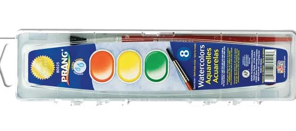
You may or may not be familiar with Prang or Prang products. And you may be thinking what does this have to do with greeting cards. It was Louis Prang, born on March 12, 1824 in Prussian Silesia who was the son of Jonas Louis Prang, a Huguenot textile manufacturer. He was the apprentice to his father and learned engraving, printing and calico dyeing.
In Paris, during the mid 1800’s, Prang met and fell in love with his wife Rosa Gerber, a beautiful Swiss woman bound for Ohio where they started a family and had one daughter. In 1851 he and Rosa were living in Boston where he began to work for an engraver Frank Leslie. Later in 1856, Rosa encouraged him go out on his own and works with a partner creating lithographs of buildings and towns in Massachusetts.
Louis Prang sometimes known as “The Father of The American Christmas Card” was an award-winning Boston lithographer/inventor who, in 1873, reproduced a holiday card autographed by Christmas Carol author, Charles Dickens. Louis Prang printed his first Christmas cards in 1875 and brought them to London. The Christmas cards were a big success. The following year, he sold them in the Northeast of the US . It still took two more years before he had the corner market in the United States. By the late 1800’s, he printed more than 5 million Christmas cards a year.
I was today old when I learned Louis Prang was the Prang behind Prang products. I mean I didn’t know Prang was an actual person, not just a product. Though he still produced greeting cards and occasionally gave tours in his Prang Lithographic Factory in Roxbury he contributed to art education. So in 1875 took a step into art education where he found his true passion. It was as a public service he manufactured art materials and supplies.
Prang closed his lithographic factory in 1897 in Roxbury. He merged his company, The Louis Prang Company with the Taber Art Co. of New Bedford. He continued to produce and still produces high-quality work and made child-safe art materials. Those famous Ticonderoga pencils also known as Dixon Ticonderoga, purchased the right to his art materials in 1909. (At the time of this merger, Ticonderoga was known as the American Crayon Company). Louis Prang later died in 1909. Who knew?
Like “video killed the radio star” the digital age killed hand written letters and cards. Sending greeting cards is becoming such an old way of communicating. It’s a shame because it’s such a personal way to show someone how much you care. The only real downside of sending a greeting card or letter is the fact it has to be mailed. Texting, messaging and emailing are quicker, more real time it can lack personality. Ok sure you can apply an emoji or a “sticker” (and I loved stickers growing up) to give your digital message more personality, but then again everyone is using them, the same ones.
Greeting cards are getting expensive. It is far less costly to send an email or a text or post a birthday greeting on a Facebook page. Hand crafting a greeting card can be much more rewarding. It doesn’t need to be elaborate, it can be simple. How many times have you poured over the greeting cards at a store looking for the right one with the right sentiment? By crafting your own card it you can write exactly what you want to say. I can hear you saying “that’s hard” “I’m not a writer.” You don’t have to be.
I have been making greeting cards since I was old enough to hold a crayon. I can remember making birthday cards for my mom and dad, their birthdays were pretty close together. My mom used to sew on occasion, so I took some fabric scraps and construction paper and cut out an apron with a little pocket and added a bow. For my dad I cut out a shirt with a tie. I glued the fabric to the construction paper and voila I had a greeting card. Genius, lol. My greeting cards have advanced a little since then.
Journey with me the month of April with learning the history of greeting cards, hand writing, and greeting card tutorials.
If Jesus was your favorite color, what would that be? Colors have values. Value is one of the seven elements in art; line, shape, space, form texture, color and value. “As an element of art, value refers to the visible lightness or darkness of a color” (thought.com). What a color is mixed with determines it’s value. or lightness or darkness.
Let’s take the color red and use watercolor to illustrate. Red is a primary color. There aren’t two colors you can mix together to make red. But red can be mixed with other colors to create various shades of red and other colors. Mix red with any of the other two primary colors blue and yellow and you get purple and orange. So with one color such as red we can create different levels of lightness and darkness by adding various amounts of water or pigment. Add lots of water and you have light wash of red or pink. By adding more pigment we are adding value or darkening the red.
The same principle can be applied to our relationship with Jesus. If Jesus was your favorite color what would that be? Jesus is the color in our lives, He adds value. Without Jesus we are nothing. That may sound harsh, but it’s the truth. We are all sinners fallen short of the glory of God – Romans 3:23. How much value does Jesus have in your life? Are you a light wash with some pigment or are you a bright, vibrant red with lots of pigment? How much pigment of Jesus are you adding to your life daily?
When we choose to serve God by serving others, when we seize opportunities to share what Jesus is doing in us, when we are praying and obeying we are adding pigment to our lives. We are deepening the value of who we are in Jesus. The blood Jesus that covers us and washes away all our sin gives us value. Only Jesus can take His deep, rich, red, precious blood and wash our hearts and make them white as snow. I can make lots of colors mixing paints and I can turn red into pink but I can not make anything white with the color red. How are you letting God add value to your life? Please comment below and please like and share this post. Thanks : )
“Do not be conformed to this world, but be transformed by the renewal of your mind, that by testing you may discern what is the will of God which is good and acceptable and perfect.” Romans 12:2(ESV)
One thing I have learned from Bob Ross is to show dark you need light and to show light you need dark. That struck a chord in me and always stuck with me. When I want something to stand out in a piece of art I highlight it. I can highlight an already light color by placing dark colors around it. Our lives need to be highlighted in a way that we stand out from the rest of the world. When we follow Jesus and walk closely with Him, those characteristics begin to show and we begin to live them out, others will start to see that there is something different in us, something different about us.
When we as Christians start to live conformed to God’s word our lifestyle begins reflect how God desires for us to live. We can live out the Gospel by helping others, doing something “for the least of these,” Matthew 25:40, loving our neighbor as ourselves; Mark 12:31, love your enemies and do good to those who hate you; Luke 6:27-36. When others see us do these hard things, when others see us loving the unlovely, when others can’t understand the peace we have amidst the chaos of today’s world, when they see us and they just don’t understand what’s different. Then we know we are living in contrast to the world. Even when others are rejecting us for what we believe, we can be assured they see a contrast.
When it comes to attracting or highlight something in a piece of art, adding contrast can be a pretty important principle. I found this definition of contrast, “Contrast Paired with Unity: Contrast can be a matter of arranging opposite elements (light versus dark, rough versus smooth, large versus small) within an artist’s piece, when the artist is working specifically to echo and repeat different levels of unity. In such artwork, contrasts can be paired colors which are chromatic opposites: in a work strictly adhering to unity those colors would be complementary. When the artist uses contrasting paired shapes such as two circles of different sizes, or a triangle and a star of the same size, contrast can be seen as opposite but partnered with the element of unity.”(https://www.thoughtco.com/definition-of-contrast-in-art-182430)
How cool is that??? Think about it for a minute. Where else do we see contrast? And where opposites can compliment? Within the body of Christ we can be unified through contrast!!! 1 Corinthians 12:12, “There is one body, but it has many parts. But all its many parts make up one body. It is the same with Christ.” (NIRV) “Contrasting paired shapes… can be seen as opposite but partnered with the element of unity.” We can still be who God created us to be no matter how different we are. In the world we will be seen as a contrast. In the body of Christ we can be unified and compliment each other. We can still have unity within the body of Christ. When the world sees how we as Christians are the same but different still living in unity as one body in Christ we can be the highlight, the contrast the world needs to see.
Our Heavenly Father is the master artist. He is the creator of all things. Only God can create something out of nothing. He has a purpose and plan for everything He created, from the tiniest single cell sea creature that keeps the ecosystem alive to the Blue whale, the largest among it’s species, God created it and created it out of nothing. John 1:1-3 “In the beginning was the Word, and the Word was with God, and the Word was God. 2 The same was in the beginning with God. 3 All things were made by him; and without him was not any thing made that was made.” Everything we use to create art has already been created by God. The pigments used in paint come from the earth, paper is from the trees, all that God has created. We are “fearfully and wonderfully made”, Psalm 139:14. God created Adam from the earth, like Adam, we are created from dust with the breath of God in us giving us life. He is the potter and we are the clay and not one of us is the same. We are all unique, one of a kind, precious in His eyes.
God’s plan for us was to live in perfection here on earth until Adam and Eve fell to sin. But before God created anything, He knew Adam and Eve would sin. He already had a plan in place. He had a plan of redemption and sent His Son to die and rise again on the third day. He provided a way for us to be free from the penalty of sin so that we could live with Him in perfection for all eternity. Just as He created the universe and humans He had a plan and purpose, a design for life.
In this Design for Life series, we will see how the design principles of design can be applied to our journey walking with Jesus not just to our art. Design principles are guidelines to follow if you want to create visuals that are effective. God gives us principles and commands to live by to help set ourselves apart from the world. There is a scene in The Chosen where Jesus is sending out the twelve and gives them instructions as to what they can and cannot bring with them. Jesus wanted them to be distinguished from the cynic philosophers. So I had to ask myself, what am I doing to stand out, to be distinguished from the rest of the world, what am I doing to live in contrast to the world?
In this new series, here on The Kedge Anchor, I’ll give a short devotional how you can apply design principles to your walk with God then join me on Caryn’s Corner YouTube Channel where I will talk more about these Design for Life posts and teach you brush lettering. Lessons will include free downloadable worksheets to practice your brush lettering.
I am excited to share with you how these design principles can be applied to our walk with God. So please, subscribe, like and share these posts and be sure to visit Caryn’s Corner Btq on YouTube.
Art speaks to me. It can convey a feeling, an emotion be it happy or sad or a concept. It adds beauty and color to my surroundings. It can motivate me. But what speaks to me more is God’s word, the Bible. It adds more color and beauty than art. It shapes me, encourages me, leads me to knowledge of God and His ways.
There are many ways to interpret a painting or a piece of art. For example, a few years ago in an art history class I was taking, the teacher asked us to interpret a piece of art. It was a black and white checkerboard similar to the one pictured here. I remember exactly what it looked like. It was square with the black and white squares on the right and as the eye moved across the image, the black squares began to fade, becoming grayer and eventually white. I don’t remember the artist, barley remember the textbook it was in.
(colourbox.com)
So as I saw it, the black and white squares represented time and as the color began to fade, it was marking the passage of time. I don’t remember what the other student’s interpretations were, I just remember getting an “A.” Now that doesn’t mean I was right. There were other perspectives my fellow students had. There was no right or wrong way to interpret that piece of art.
However, the Bible has only one interpretation but many applications. The Gospel has one interpretation; Jesus came to die for us sinners, rose again on the third day, conquering death and saving us from eternal separation from God. We have to choose Him, we have to recognize our need for Him to save us. There are many words that can be used to convey salvation. But adding to God’s word, Deuteronomy 4:2 or His plan of salvation or to take away anything to make it fit our beliefs, is wrong. You can speak the Gospel with different words that mean the same thing but the meaning is still the same. And yet scripture, with one interpretation can be applied to many areas of our lives.
For example, James 1:9 , “Wherefore, my beloved brethren, let every man be swift to hear, slow to speak, slow to wrath:” – KJV.
Two different versions saying the same thing. Digging deeper into the original Greek can help understanding this passage even more. The message is pretty clear, listen first, be slow to respond, don’t get angry so quickly, keep your mouth closed until the other person is finished speaking. And this passage can be applied to so many situations in our lives; in a marriage, communication is a big part of any relationship, parents, siblings, families. It can be applied to the workplace with your boss and co-workers. Anywhere there is talking between two people this verse has application. Get all the information first before you react or respond.
When it comes to scripture it’s important to understand, the who, what, why, where, how of who wrote it, what is the message God is speaking. Like communicating with others, God is communicating with us through His word. So out of respect to the men, authors who penned the books of the Bible we need to be objective when studying scripture and try to understand what the author, the prophet or apostle, ultimately God, is trying to communicate to us. Once we have the meaning we can apply it to many areas of our lives.
Now the artist who painted the simple black and white checker board only he or she knows what he or she was intending to communicate. With art we have the liberty to interpret it anyway we want, it can have any meaning we want. But, with scripture we have a responsibility to read and interpret it the way God intended.
Is there a piece of art that speaks to you? One that stirs your soul, strikes an emotions stirs up a memory? I love this image of the wave engulfing and crashing on the lighthouse. Imagine for a minute, being inside that lighthouse.
Image: Mathieu Rivrin/Solent News
What does it look like, sound like, feel like? The lighthouse is Jesus. The water, waves are life crashing around me. But I am safe inside the lighthouse, safe in the One who is in charge of those waves crashing on me. (“Even the winds and waves obey Him.” Matthew 8:23-27)
Is there a verse in the Bible that encourages you, comforts you, corrects you? Hebrews 6:19 – keeps me anchored in Hope. Comment what pieces of art speak to you, what are your favorite verses that speak to you, comfort you, encourage or correct you.


You must be logged in to post a comment.